Experience Is Everything coming April 2026. Order now.

We’ve come to accept the incredible pace of innovation. But have you thought of how it’s impacting your customer’s expectations?
With the widespread acceptance of apps like Uber and Tinder, customers are demanding more personalized, instantaneous experiences. But many brands aren’t keeping up, leaving the door wide open for competitors to reap the rewards of meeting these demands. (Uber, of course, is the on-demand ride sharing app and Tinder is the dating app allowing users to “swipe” their preference based on a photo.)
It’s becoming common for taxi drivers to have to chase down well-meaning but forgetful customers who give a quick “thanks!” before bolting from the backseat of the cab. “Ohmygosh!” They say, “I forgot it wasn’t Uber!”
With the Uber (or Lyft or others entering this space) app, everything about the actual transaction is handled within the app. After scheduling a ride, the app is also a complete payment system. You can add tips and rate your driver well after leaving the vehicle. This is a seemingly small difference to the experience, but makes a huge difference to the customer who needs to get somewhere fast.
Have you ever had the fastest driver in a cab who is the S-L-O-W-E-S-T at figuring out the total and getting you out of the car once you arrive? It’s frustrating. The Uber experience is now the standard. I can do it on the app!
Tinder, another popular app, is dating based on snap judgment. If you like the picture presented, you swipe one way, and if you don’t like the picture, you swipe another. It’s rejection in its more basic form. But it works for the way many people date now.
These all-within-the-app personalized experiences are clearly working. So why aren’t more brands, retailers and services offering this type of experience? I think we’ll be seeing more of them soon.
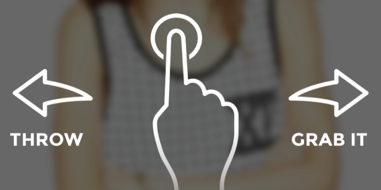
Most recently, Grabble has entered the scene in the UK. Using the same premise as Tinder, the shopping app offers up a photo of something to buy. They’ve partnered with several large and emerging retailers, and the more you swipe your preferences, the more personalized it becomes. I played with the app for just a few minutes and managed to find some nice things.

I think this app is a preview of this personalized, in-app experience evolution. Grabble does a few things very right.
The photos are stark and easy to see on a smaller screen. The product stands alone. The buttons are always a choice of 2.
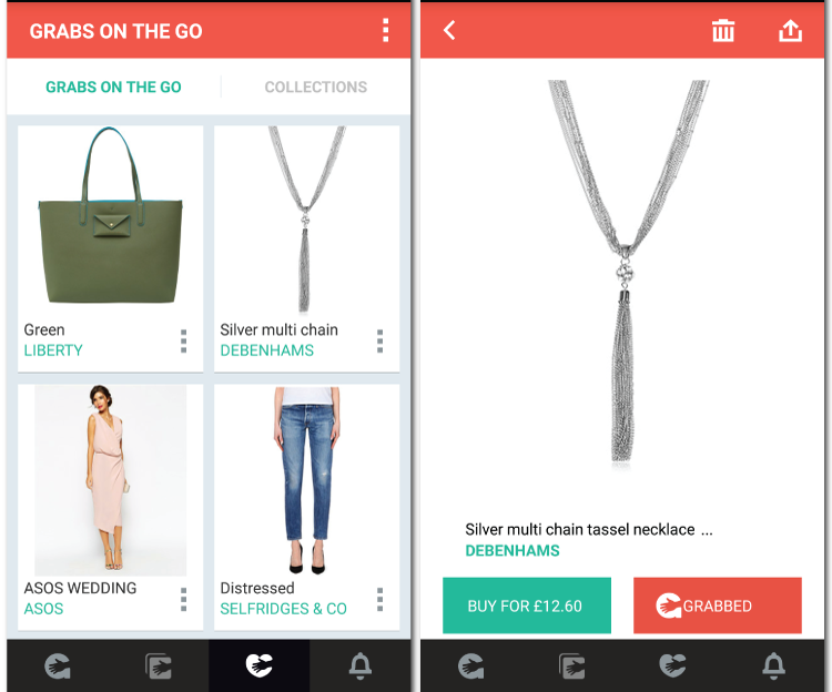
The app does a great job offering several ways to interact with the products and collections. Users are in control. Want to add things to a “necklaces” collection? You can name your own and add to it, much like a Pinterest board.
The smartest thing is how the buy process is contained within the app. No need to dig out credit cards or link to a poorly optimized site. It’s as easy as clicking the buy button. (Easy and perhaps, dangerous for those who enjoy shopping!)
I think this is the tip of the proverbial iceberg. In a few years, we’ll be discussing the mobile apps best optimized for our watches. In a few years after that? Who knows, but I can’t wait to be a part of it.
Oh, and Grabble? Please come to the United States. That necklace is pretty.
Tinder is spot on with their mobile customer expectations, but I think their total customer experience might need some work. Hear more about it!

Listen to the full episode with Invisible Sale author Tom Martin.
 Jeannie is an award-winning customer experience expert, international keynote speaker, and sought-after business coach who is trailblazing the movement from “Reactive Customer Service” to “Proactive Customer and Employee Experience.” More than 500,000 people have learned from her CX courses on LinkedIn Learning, and her insights have been featured in Forbes, The Chicago Tribune, The Wall Street Journal and NPR.
Get Jeannie’s insights in your inbox each week by subscribing to The Weekly Win and follow her on LinkedIn, Instagram and YouTube.