Experience Is Everything coming April 2026. Order now.
FAQ is another one of those terms we didn’t even know before the dawn of the internet age. Most of us were blissfully unaware of this acronym for “Frequently Asked Questions” now living on many web sites.

When we ask our clients a question like “What are your touchpoints?” we get a lengthy list of the many places where customers and company interact. And yet it’s easy (and more often than not, necessary) to categorize these important moments of interaction into big categories. Checking off “web site” as a touchpoint is part of the process, but it’s better to dig into the specifics of what that means.
“Frequently Asked Questions” is too often code for “we didn’t know where to put this information.” It’s time to brush off the FAQ’s and make them useful for your customers.
Here are a few issues with many FAQ sections:
These “helpful” sections have been around since the first web sites began rolling out in the 1990’s. Many seem to be stuck there.
Humana, the very large medical insurance provider, has an FAQ section that may prompt a headache.
Instead of using technology to determine who the customer is (member, provider, employer, etc.) they state these questions are the most common among all these groups. Those groups are very different, and offering relevant answers to questions could lead to a better relationship.
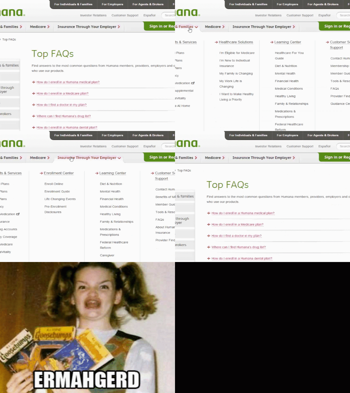
Digging into the appropriate tabbed section doesn’t help much, either.
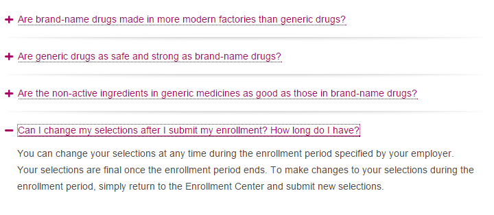
Humana clearly has added to this list, but not necessarily in any logical order. This means the onus is on the customer to find the appropriate question which may match closely enough to what they are seeking. Not really the greatest way to organize information.
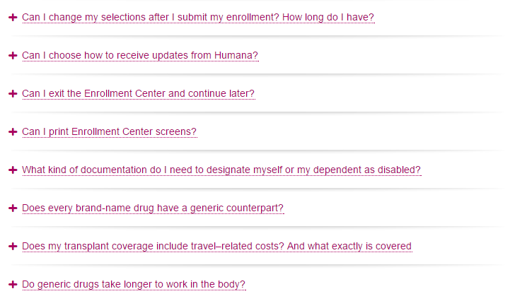
The list above jumps from communication updates to enrollment to brand name v. generic drugs. Then it bounces around some more, creating a total lack of ease in using this “helpful” section. It’s not ideal for the mobile world we live in, either. Fat finger syndrome could lead to a lot of frustration.
Groupon, the daily deal site, does a great job by leveraging technology to get to the information quickly for the customer.
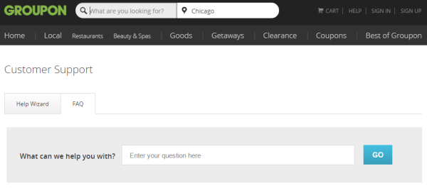
All of this is mobile optimized.
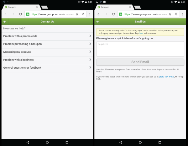 Compare what might happen with seeking information from the Humana FAQ section versus the Groupon FAQ section.
The customer would get the answer much faster with the Groupon site. Humana’s site puts way too much on the customer to solve.
As the customer hunts around for the appropriate questions, their chances of becoming frustrated go up with every click. And let’s say they find a question that works. Many of the answers don’t have links for where to go. That next step is up to the customer, as well.
Groupon provides the link to use to solve the problem.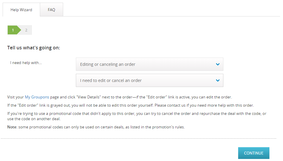
The more effort required, the more likely they will become dissatisfied and move on to a competitor. I realize these two businesses are very different animals. Insurance is complex and complicated, serving many different types of people. Groupon is a more straight-forward business-to-consumer organization, but I don’t dare to oversimplify that.
However the comparison here should highlight how the type of business doesn’t really matter in touchpoints like this one. FAQ’s should add value to the relationship with the customer, or maybe even a moment of delight. In the case of many of the sections we see today, however, there just isn’t care invested in this particular touchpoint.
Help your customers help themselves by investing in creating the best FAQ and help sections possible for your digital experience.
And while we’re at it, who wants to go out to eat? I have a few Groupons to use.
Image credit: betsyweber via Creative Commons license
Are your FAQ’s designed to offer the most effortless, seamless line of support possible? Our team is highly trained in micromapping and evaluating digital experiences, including FAQ and help sections.
Get in touch to request a quote!
 Jeannie is an award-winning customer experience expert, international keynote speaker, and sought-after business coach who is trailblazing the movement from “Reactive Customer Service” to “Proactive Customer and Employee Experience.” More than 500,000 people have learned from her CX courses on LinkedIn Learning, and her insights have been featured in Forbes, The Chicago Tribune, The Wall Street Journal and NPR.
Get Jeannie’s insights in your inbox each week by subscribing to The Weekly Win and follow her on LinkedIn, Instagram and YouTube.